
How to Turn Your Handwriting Into a Font with AI
Upload a photo of natural handwriting, let AI create a complete basic character set, then review, refine, and build a reusable personal font.
By Handwriting AI Team · · 10 min read
From one handwriting photo to an editable font
The main workflow starts with ordinary handwriting, not a character template. AI uses the visible writing as style evidence, creates the missing basic characters, and opens the complete result for review before you build the font.
A varied handwriting sample gives AI more evidence for letter shapes, proportions, slant, numbers, and punctuation.
AI handwriting-to-font video
This video position is reserved for the upcoming walkthrough of photo upload, AI recognition, glyph review, and font building.
Watch on YouTubeBefore you start
Have a clear handwriting photo and a Handwriting AI account ready. Each AI scan uses 10 AI credits. Free includes creating, saving, and editing one custom font draft; Starter or higher is required to build and use it, and Pro or Premium is required to download the TTF.
Open the handwriting font maker, choose AI from a photo, and upload a clear sample with varied letter shapes. Crop to the writing and let AI create a complete basic character set in the same visual style. Review every generated glyph, correct strokes and spacing, then preview and build the font. The printable template is the free alternative when you have access to a printer and prefer not to spend AI credits.
Step 1
Choose a useful handwriting sample
Use a clear photo containing several lines of your natural handwriting. A varied sample gives AI more evidence than one short sentence, especially when it includes uppercase and lowercase letters, numbers, and punctuation.
Write as you normally do. Do not trace a digital font or force every letter into an unfamiliar style.
Use dark ink, even lighting, and a photo that keeps the strokes in focus. Avoid glare, heavy shadows, ruled lines crossing the letters, and messaging-app copies that blur fine marks.
Pangrams are useful, but existing notes and letters can also work when the crop contains enough distinct shapes.
Before moving on: You can zoom into the photo and distinguish dots, commas, loops, and thin strokes without guessing.
Step 2
Upload and crop the handwriting photo
Open the handwriting font maker, stay on AI from a photo, and choose a JPEG, PNG, or WebP. Crop tightly around the useful writing so decorative objects and empty paper do not become part of the model input.
Keep complete letters inside the crop. Do not cut off ascenders, descenders, or punctuation at the edges.
Review the prepared crop before starting. The displayed pixel dimensions and file size describe the image that will be sent for recognition.
Each new handwriting scan reserves 10 AI credits. Gifted credits are used first. Confirmed failures return the reservation; editing, building, and rebuilding do not use AI credits.
Before moving on: The crop contains only the writing you want AI to study, and every important stroke remains visible.
Step 3
Let AI create the basic character set
Start recognition after checking the crop. AI extracts letterforms it can identify and simulates missing printable characters from the same proportions, slant, stroke weight, and recurring shapes.
The result is a proposed character sheet, not a claim that every glyph appeared in the source photo.
Recognized shapes should stay close to the visible sample. Simulated shapes extend that style to characters the photo did not contain.
Wait for the result to finish and save before closing the page. If the request fails clearly, the reserved AI credits are returned.
Before moving on: A complete basic character sheet appears and its overall slant, weight, and proportions resemble the uploaded writing.
Step 4
Review, correct, and save the glyphs
Inspect the generated character sheet before treating it as your font. Compare distinctive letters with the source, then check easily confused characters, punctuation, dots, and narrow strokes.
Use Refine strokes with Brush or Eraser to repair a shape or remove an unwanted mark.
Use Baseline, Size, Horizontal position, Left spacing, and Right spacing while watching the word preview. A glyph can look correct alone but still sit badly beside other letters.
AI also creates missing characters and connected groups such as th and ing. If you still prefer a different handwritten shape after review, use Add selected characters to replace only those glyphs. Pro and Premium can also store alternate letterforms.
Before moving on: Representative words read naturally, and the character library is saved under a recognizable font name.
Step 5
Preview and build the font
Enter representative words in Word samples for spacing. Compare Compact, Natural, or Airy and use Rebalance when you need to recalculate spacing. Review individual problem letters afterward, then choose Save changes.
Useful test words include minimum, office, letter, and handwriting. They expose repeated stems and uneven gaps. A global spacing preset affects the library, so use it before spending time on the final per-letter spacing adjustments.
Choose Preview and build. In Review your font in real text, enter a sentence with uppercase letters, repeated letters, digits, and punctuation. Check the characters, variants, and missing counts as well as the visible text.
Choose Build my font and wait for the success message. When you later edit the character library, save and build again so the generated font includes those edits.
Before moving on: The font is ready in My fonts. Saving characters alone is not the same as finishing the generated font.
Step 6
Use your handwriting font
In My fonts, choose Use in editor. The main editor opens with your personal font selected under My handwriting. Replace the text with the sample below or write your own note.
Start with fixed paper and turn Handwriting realism and Corrections off. This makes it easier to inspect the font itself. If your writing looks small, increase Font size under Layout; check the actual preview after changing it.
The example below uses 48 px type, 1.7 line height, a 120 px margin, 0 px letter spacing, and 2 px word spacing. Its background is Cream and its ink is blue. These reproduce the page setup; your handwriting will still look different.
Pause for the preview to update, review the whole page, then choose Download JPEG. The image is a rendered page, while the TTF is the reusable font file. Pro and Premium also provide Download TTF in the font workspace or library.
Before moving on: The downloaded image contains the text you typed, rendered with your saved font. Compare a few distinctive letters with your source sheet.
When to use the free printable template instead
AI from a photo is the recommended and fastest method. It learns from ordinary handwriting and generates the complete basic character set, including missing characters and connected groups such as th and ing. Each new AI scan uses 10 AI credits.
Choose Printable template when you want a free workflow that does not use AI credits and you have access to a printer. Print the sheet, write in the labeled boxes, then photograph or scan it for local character extraction.
- Use AI from a photo for the quickest workflow and automatic completion of the character set.
- Use the printable template when avoiding AI-credit cost matters more than convenience.
- The template requires a printer plus a phone camera or scanner; the AI method does not require printing.
How the optional template workflow works
Download the two-page template and print it at 100% actual size. Write only on page 1, keep all four corner markers visible, and use page 2 as a placement guide without photographing it.
Photograph or scan the completed first page, switch the font maker to Printable template, and upload the PDF, JPG, or PNG. Review the detected thumbnails before saving. The same character editor, spacing controls, preview, and build steps apply afterward.
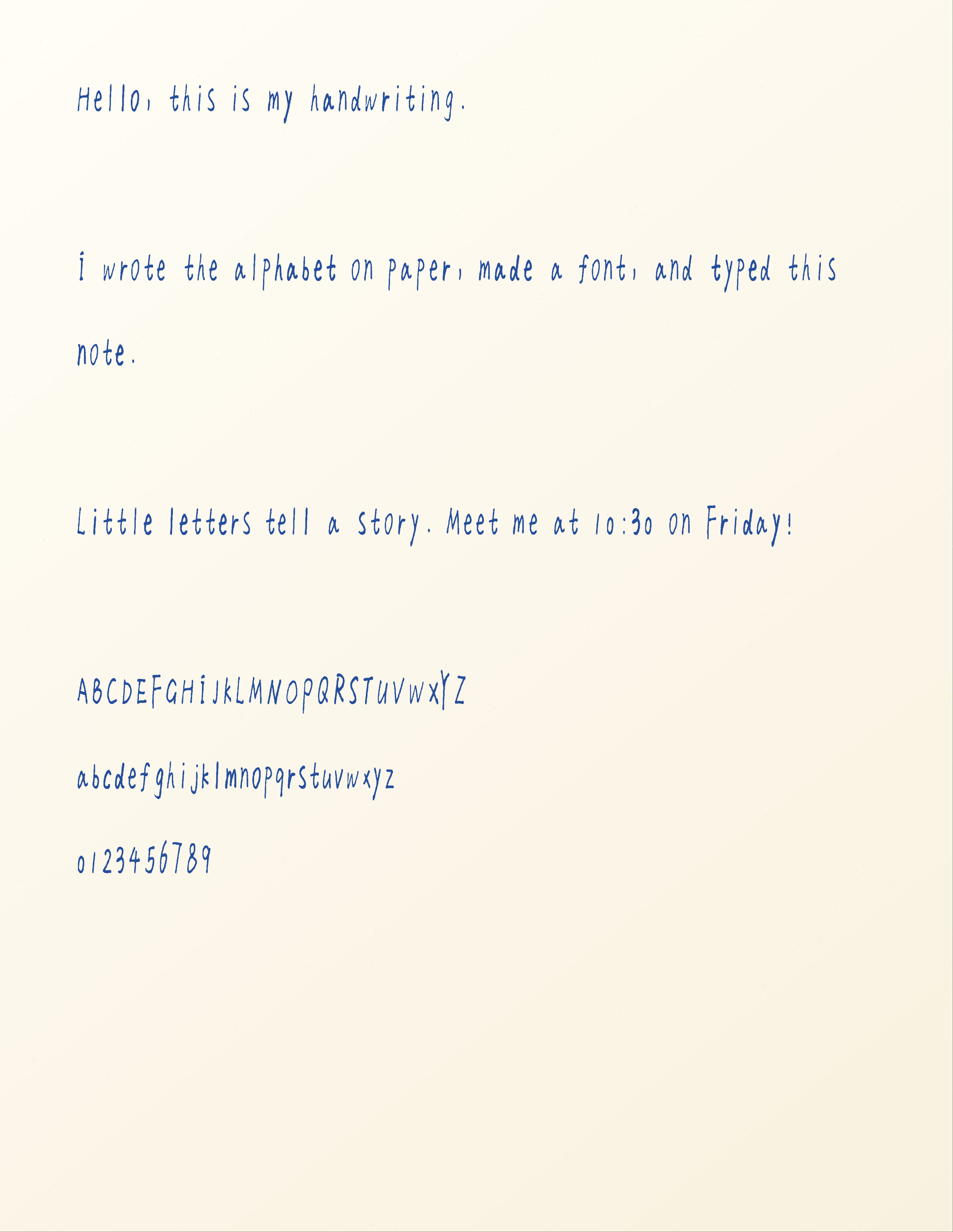
Reproduce the typed handwriting sample
Use your own saved font with this exact text. Keep the blank lines when pasting it into the editor. The settings below document the exported example; change them if your own glyphs need a different size or spacing.
Hello, this is my handwriting.

I wrote the alphabet on paper, made a font, and typed this note.

Little letters tell a story. Meet me at 10:30 on Friday!

ABCDEFGHIJKLMNOPQRSTUVWXYZ
abcdefghijklmnopqrstuvwxyz
0123456789
- Font
My Handwriting · AI-generated basic character set
The character library is created from the uploaded handwriting style and remains editable before and after the first build.
- Paper
Fixed paper · Plain White · Cream background · Letter
A simple surface makes letter shapes easy to inspect. Plain White is the paper-style label; Cream is the separate background setting.
- Font size / line height
48 px / 1.7
Keeps natural letter proportions readable, with room for ascenders, descenders, and connected letter groups.
- Letter / word spacing
0 px / 2 px
Preserves the font's natural joins while separating words. Fix isolated bad gaps in the font library first.
- Margin
120 px
Leaves a clear page edge around the test text.
- Ink
Blue · #244f9e
Keeps the finished example visually close to the blue-ink source while making the reusable font easy to inspect.
- Realism / corrections
Off / Off
Shows the saved letter shapes without extra placement, ink, or correction effects. Word placement, line starts, line-spacing variation, ink flow, and letterform variation are all zero; letter tilt is off.
- Page look
Texture 0% · Shading 0% · Soft focus 0%
Keeps additional page effects out of the font comparison.
- Output
JPEG · one page · 2813 × 3638 pixels
The actual downloaded file is linked below. The displayed WebP is a smaller web version of that export.
Fix common handwriting font problems
AI generated the wrong shape for one letter
Select that glyph and compare it with the source photo. Repair a small problem with Brush or Eraser, or use Add selected characters to replace it with a newly written version. Save and rebuild before checking it again in text.
Only one letter looks too high or too small
Select that letter and adjust Baseline or Size while checking Word preview. Changing the main editor's font size scales every letter and will not fix a single misaligned glyph.
Words look too tight or have one awkward gap
Try a word-spacing preset for a general problem. For a local gap, adjust the relevant glyph's left or right spacing. Save and rebuild, then check the same sentence in the editor.
The editor still shows an older version
Return to the library and check whether the font needs rebuilding. Save changes, complete Preview and build, and then use the updated font from My fonts.
Repeated letters look identical
A basic font can have one letterform per character. Pro and Premium can store alternate letterforms. Add genuinely different versions and use the editor's letterform variation control after rebuilding; moving letters alone does not create new glyph shapes.
What this example covers
- The complete basic font covers printable ASCII, not accented letters or every writing system. Check the supported character set before planning a multilingual font.
- AI simulates characters that are absent from the photo. These inferred shapes follow the visible writing style but are not exact copies of letters the writer actually provided, so review and correction remain important.
- External apps differ in font installation and alternate-character support. This example verifies the font inside Handwriting AI; it does not demonstrate Word, Canva, Goodnotes, or fully joined cursive output.
Questions about making your own handwriting font
Can I make my own handwriting font for free?
Yes. A Free account can import, save, and edit one custom font draft. Building and using that font requires Starter or higher, while downloading the generated TTF requires Pro or Premium.
Do I need a scanner or printable template?
No. The recommended AI workflow starts with a phone photo of ordinary handwriting and does not require printing. Use the printable template when you want the free, no-AI-credit workflow and have access to a printer plus a phone camera or scanner.
Can I upload an old handwritten letter instead?
Yes. Crop to a clear section with several representative letter shapes. AI extracts the visible forms and simulates missing basic characters in the same style. A broader sample improves the evidence available, while the printable template gives you direct control over every character.
Why does my typed note look different from the example?
The letters come from your own writing. Font size, line height, ink, spacing, and paper also affect the page. Match the example settings to compare the layout, then tune them for your glyphs.
Create a font from your handwriting photo
Upload a clear sample, review the AI-generated characters, and refine the details before building your personal font.
Create a font from a photo