How to Turn Your Handwriting Into a Font
Follow a real example from a handwritten alphabet to a typed note. Learn how to fill the template, check characters, fix spacing, and build a font you can use again.
By Handwriting AI Team · · 10 min read
A real handwriting-to-font example
The first image shows the original handwriting. The second shows a note typed afterward using the saved font, named My Handwriting. Its library contains 94 characters and no extra variants. Compare the tall, narrow letters and the shapes of a, g, and y.
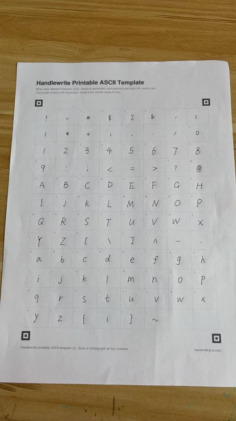
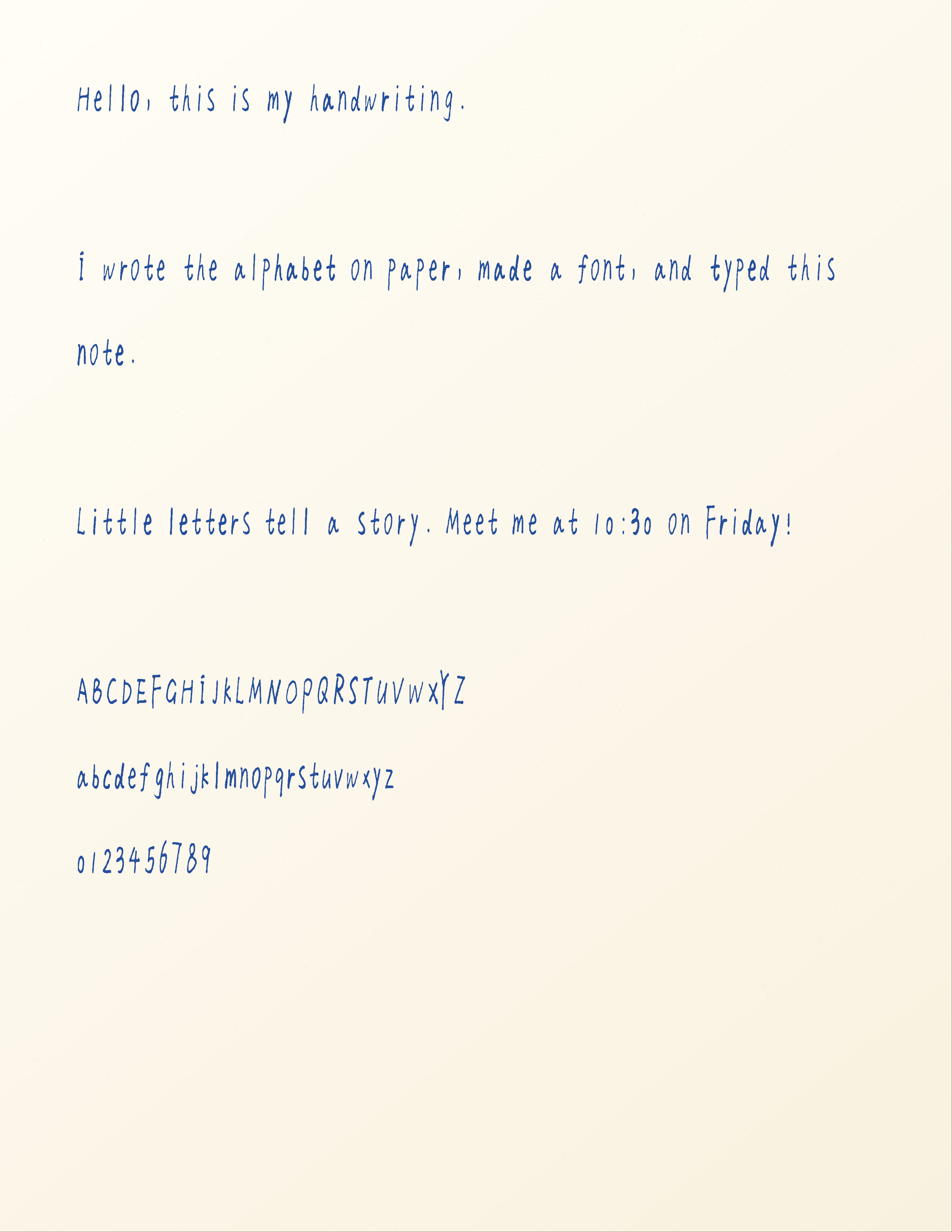
Select either image to inspect the original file. The generated note is a digital JPEG export, not a photograph of a printed note.
Watch the handwriting-to-font workflow
This short walkthrough uses English narration and on-screen captions to show where to download the template, how to photograph it, where to upload it, and which controls to use before building the font.
Before you start
Have the printed A4 template, a dark pen, a camera or scanner, and a Handwriting AI account ready. You can try importing and previewing on Free. Complete the save-and-build workflow on Starter or higher; use Pro or Premium if you need to download the TTF.
Download the handwriting template, write one character in each labeled box, and upload a clear photo with all four corner markers visible. Review the detected letters, save them to your character library, adjust their strokes and spacing, then choose Preview and build and Build my font. Use the finished font from My handwriting in the main editor.
Step 1
Download the handwriting font template
Open the handwriting font maker and choose Download the free template. Print the A4 PDF at actual size, keeping every character box and all four square corner markers on the sheet.
The full sheet has 94 visible printable ASCII characters: English uppercase and lowercase letters, numbers, punctuation, and symbols. Space is generated automatically, so there is no space box to fill.
If your printer uses US Letter paper, check the print preview before printing an A4 template. Do not let the printer crop the lower markers. Follow the dimensions of the supplied template rather than assuming the page is Letter-sized.
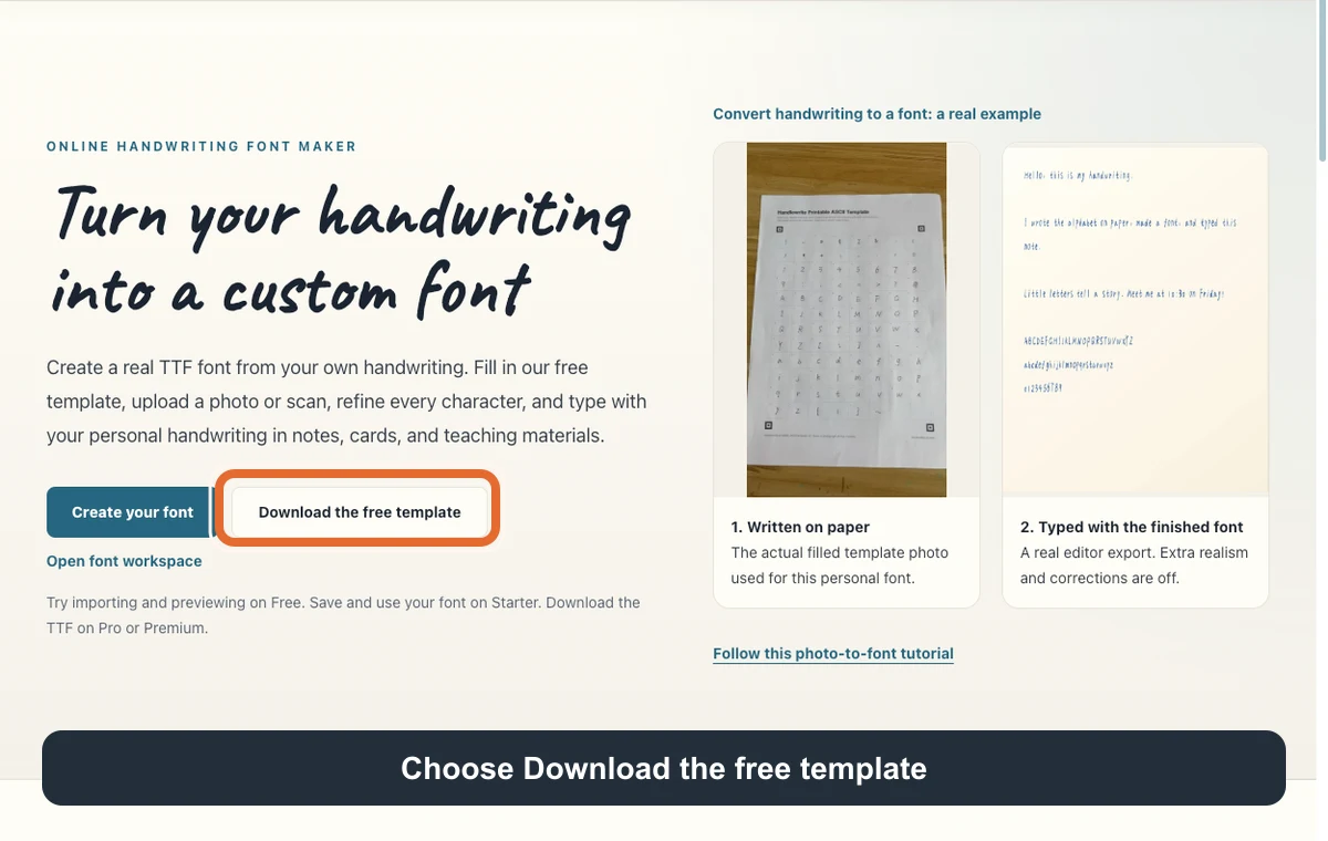
Before moving on: You can see all four square markers and the labels for the final row of characters on the printed sheet.
Step 2
Write one character in each labeled box
Use a dark pen and write the character shown by each box's small label. Leave space between your strokes and the box edges. Write your ordinary letter shapes at a consistent size.
Give lowercase letters a consistent body height while leaving room for tall letters such as b and h, and descending strokes such as g and y. Keep the dot with i and j inside the same box.
Check pairs that are easy to confuse: uppercase I and lowercase l, zero and uppercase O, and the comma and period. A full set of detected boxes does not by itself prove that every mark is the intended character.
This workflow captures separate characters. Write each one separately even if your usual handwriting is joined. It does not automatically reconstruct the joins and ligatures of an entire cursive sentence.
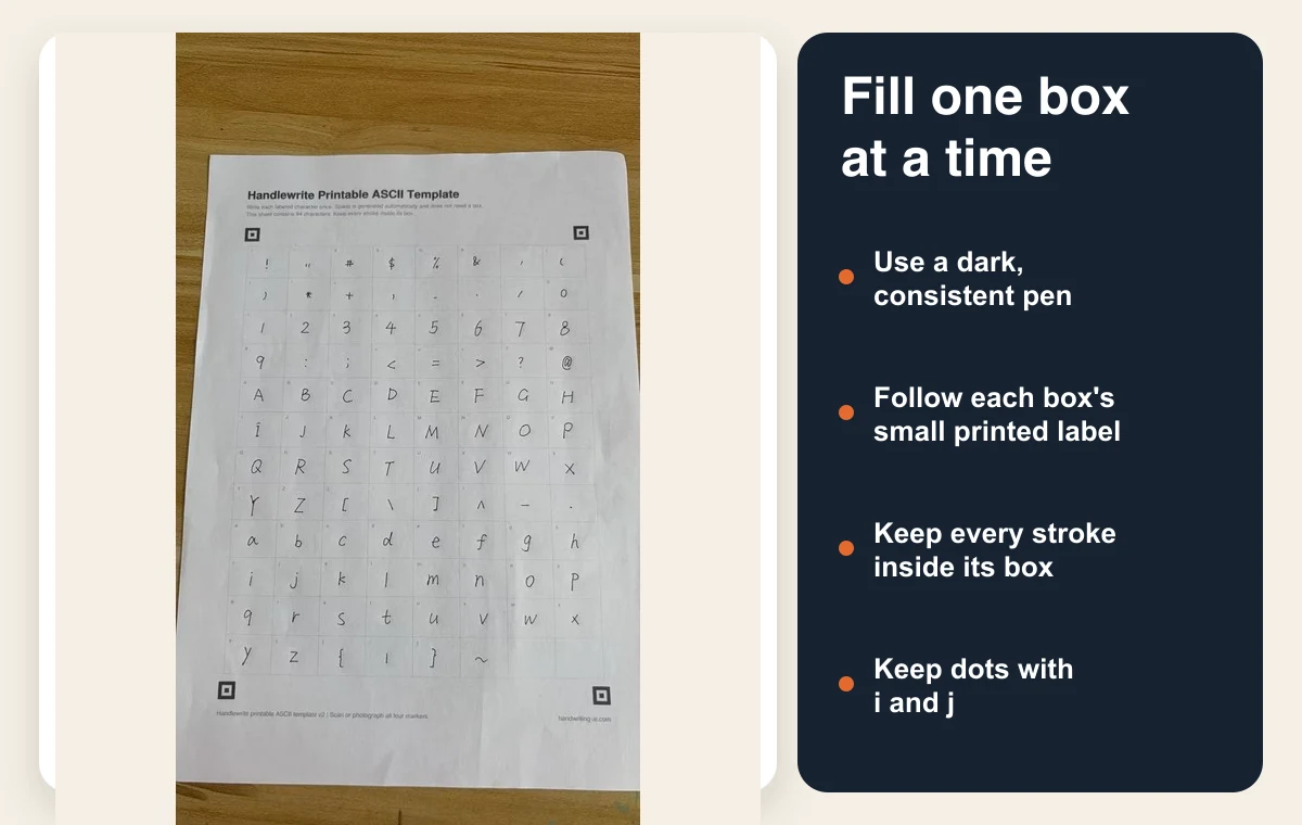
Before moving on: Each filled box contains only its assigned character, including any dot or punctuation mark.
Step 3
Photograph the completed sheet and import it
Photograph the sheet in portrait orientation, with the page flat and all four corner markers visible. Use even light and hold the camera as square to the page as you can. In the signed-in workspace, choose Upload filled template and select the completed PDF, JPG, or PNG.
Use the original camera file when possible. Avoid a screenshot of the photo or a messaging-app copy that has made the strokes blurry. You do not need to remove the table around the sheet; the corner markers locate the template.
The source photo in this guide has visible creases and uneven lighting. It is a real working example, not a recommended lighting setup. A flatter sheet and more even light give you cleaner material to review.
The importer expects this template, not an ordinary notebook page. If detection fails, check orientation, visible markers, blur, and whether you uploaded the correct template before changing the writing.
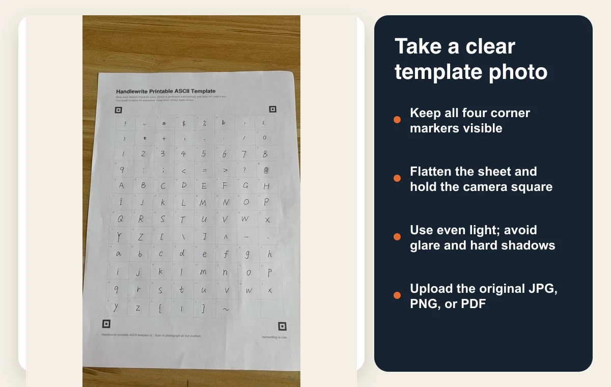
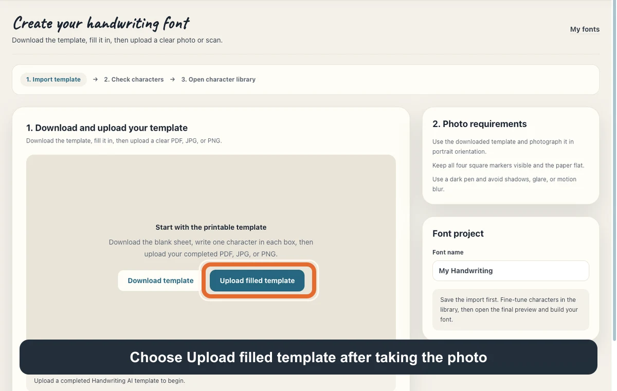
Before moving on: The workspace changes to Review imported characters and shows labeled character thumbnails. Inspect those thumbnails before saving.
Step 4
Review and save the detected characters
Compare the thumbnails with your sheet. Look for empty boxes, missing dots, clipped strokes, and unwanted lines. Give the project a recognizable name, then choose Save 94 characters to library if all 94 were detected; the button's count follows your import.
The font used here was already saved with 94 characters and no extra variants. That describes this particular library; another photo may need corrections before it is ready.
Saving the library is a separate step from building the installable font. Free accounts can try importing and previewing. Starter or higher is required to save and build.
If only a few characters need to be rewritten, the library's Add selected characters flow lets you choose them, download their matching template, and upload that completed sheet. Keep that flow's selected-character template paired with its upload step.
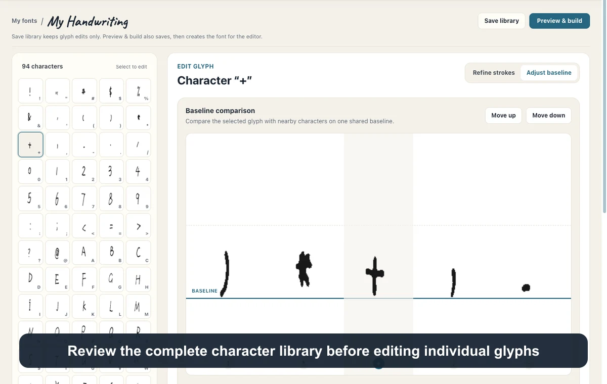
Before moving on: You reach Character library and can select individual letters to edit.
Step 5
Correct strokes, baseline, and size in context
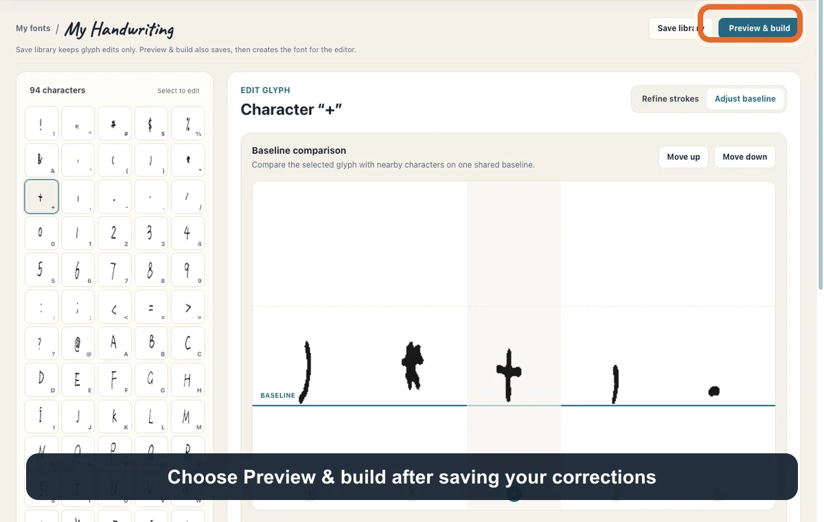
Select a character in the library. Use Refine strokes with Brush or Eraser to repair a mark or remove a stray pixel area. Use Adjust baseline to compare its position with neighboring characters.
The position controls include Baseline, Size, Horizontal position, Left spacing, and Right spacing. Change one at a time and watch Word preview instead of judging only the enlarged glyph.
In Adjust baseline, use Move up and Move down or the arrow keys. Shift makes larger steps. Align lowercase bodies consistently while allowing intended descenders below the baseline.
For example, the saved a inspected for this guide had Baseline 0.12, Size 1.00, and left and right spacing of 30. These are properties of this sample, not universal settings to copy. The source handwriting and neighboring letters determine the right values.
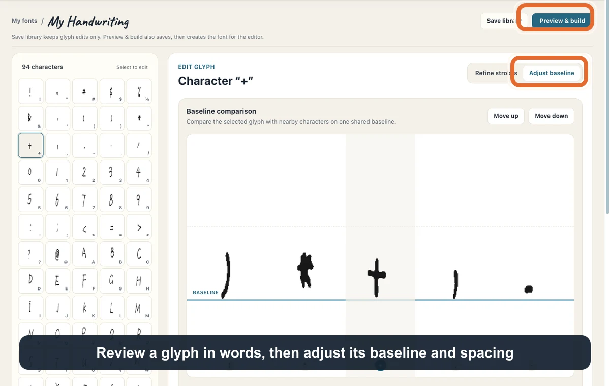
Before moving on: The letter reads naturally in a word and is not floating above, dropping below, or colliding with its neighbors.
Step 6
Check word spacing, then build the font
Enter representative words in Word samples for spacing. Compare Compact, Natural, or Airy and use Rebalance when you need to recalculate spacing. Review individual problem letters afterward, then choose Save changes.
Useful test words include minimum, office, letter, and handwriting. They expose repeated stems and uneven gaps. A global spacing preset affects the library, so use it before spending time on the final per-letter spacing adjustments.
Choose Preview and build. In Review your font in real text, enter a sentence with uppercase letters, repeated letters, digits, and punctuation. Check the characters, variants, and missing counts as well as the visible text.
Choose Build my font and wait for the success message. When you later edit the character library, save and build again so the generated font includes those edits.
Before moving on: The font is ready in My fonts. Saving characters alone is not the same as finishing the generated font.
Step 7
Type a note with your own handwriting
In My fonts, choose Use in editor. The main editor opens with your personal font selected under My handwriting. Replace the text with the sample below or write your own note.
Start with fixed paper and turn Handwriting realism and Corrections off. This makes it easier to inspect the font itself. If your writing looks small, increase Font size under Layout; check the actual preview after changing it.
The example below uses 48 px type, 80 px line height, a 120 px margin, and 2 px letter and word spacing. Its background is Cream and its ink is blue. These reproduce the page setup; your handwriting will still look different.
Pause for the preview to update, review the whole page, then choose Download JPEG. The image is a rendered page, while the TTF is the reusable font file. Pro and Premium also provide Download TTF in the font workspace or library.
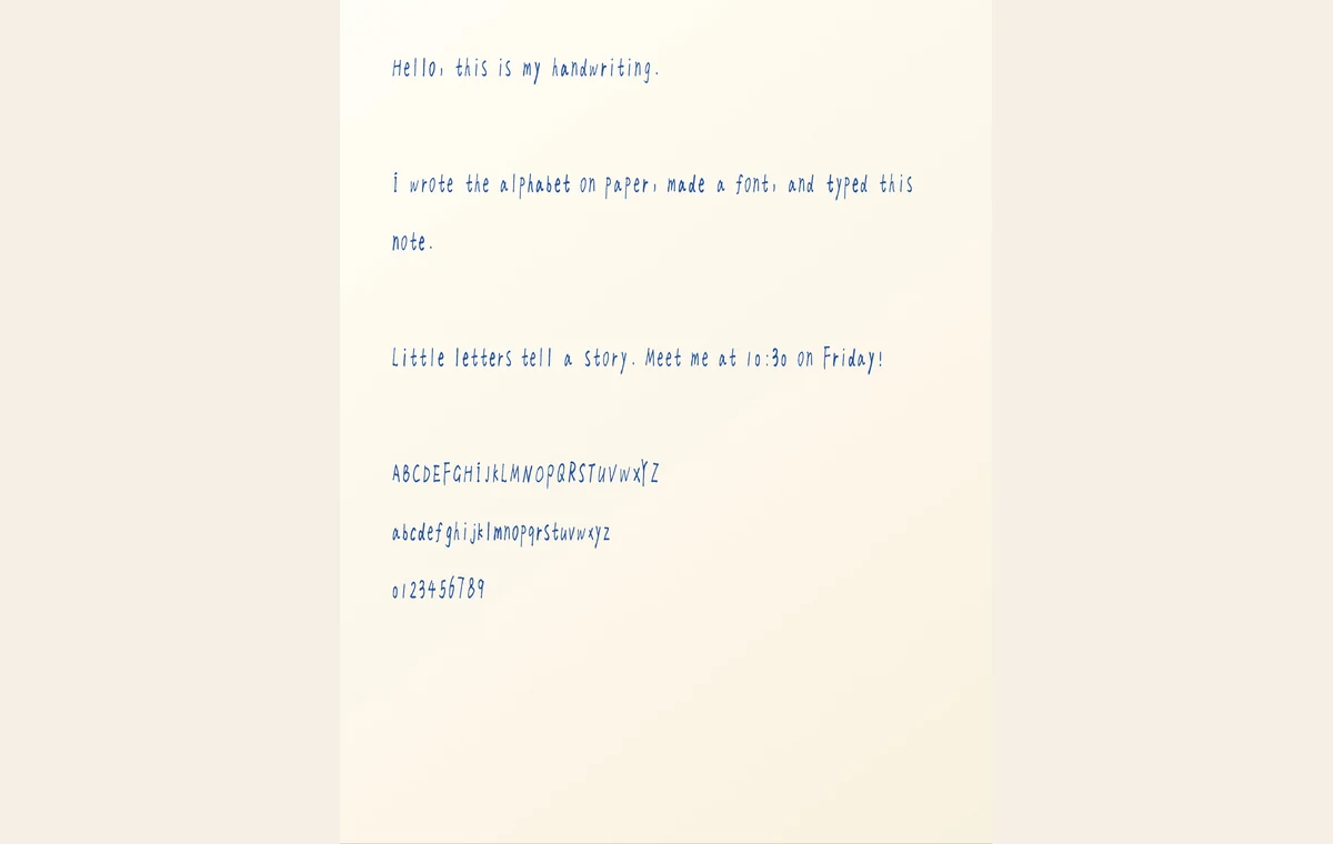
Before moving on: The downloaded image contains the text you typed, rendered with your saved font. Compare a few distinctive letters with your source sheet.
Reproduce the typed handwriting sample
Use your own saved font with this exact text. Keep the blank lines when pasting it into the editor. The settings below document the exported example; change them if your own glyphs need a different size or spacing.
Hello, this is my handwriting.

I wrote the alphabet on paper, made a font, and typed this note.

Little letters tell a story. Meet me at 10:30 on Friday!

ABCDEFGHIJKLMNOPQRSTUVWXYZ
abcdefghijklmnopqrstuvwxyz
0123456789
- Font
My Handwriting · 94 characters
The saved personal font used for this example. Your own template will produce different letter shapes.
- Paper
Fixed paper · Plain White · Cream background · Letter
A simple surface makes letter shapes easy to inspect. Plain White is the paper-style label; Cream is the separate background setting.
- Font size / line height
48 px / 80 px
The sampled handwriting is narrow. This larger size makes it readable, with room between lines for ascenders and descenders.
- Letter / word spacing
2 px / 2 px
Adds a little separation around the font's built-in spacing. Fix isolated bad gaps in the font library first.
- Margin
120 px
Leaves a clear page edge around the test text.
- Ink
Blue · #244f9e
Separates the generated note from the dark pen used on the source template.
- Realism / corrections
Off / Off
Shows the saved letter shapes without extra placement, ink, or correction effects. Word placement, line starts, line-spacing variation, ink flow, and letterform variation are all zero; letter tilt is off.
- Page look
Texture 0% · Shading 0% · Soft focus 0%
Keeps additional page effects out of the font comparison.
- Output
JPEG · one page · 2813 × 3638 pixels
The actual downloaded file is linked below. The displayed WebP is a smaller web version of that export.
Fix common handwriting font problems
A dot or punctuation mark is missing
Compare the detected thumbnail with the source box. If the mark was too faint or clipped, rewrite that character on a selected-character template and import it through the matching flow. Check the thumbnail again before rebuilding.
Only one letter looks too high or too small
Select that letter and adjust Baseline or Size while checking Word preview. Changing the main editor's font size scales every letter and will not fix a single misaligned glyph.
Words look too tight or have one awkward gap
Try a word-spacing preset for a general problem. For a local gap, adjust the relevant glyph's left or right spacing. Save and rebuild, then check the same sentence in the editor.
The editor still shows an older version
Return to the library and check whether the font needs rebuilding. Save changes, complete Preview and build, and then use the updated font from My fonts.
Repeated letters look identical
This sample has one letterform per character and letterform variation is off. Pro and Premium can store alternate letterforms. Add genuinely different versions and use the editor's letterform variation control after rebuilding; moving letters alone does not create new glyph shapes.
What this example covers
- The supplied full template covers printable ASCII, not accented letters or every writing system. Check the supported character set before planning a multilingual font.
- The source photo and output demonstrate one personal font. Results depend on the writing and photo quality; an ordinary handwritten page cannot replace the template.
- External apps differ in font installation and alternate-character support. This example verifies the font inside Handwriting AI; it does not demonstrate Word, Canva, Goodnotes, or fully joined cursive output.
Questions about making your own handwriting font
Can I make my own handwriting font for free?
You can download the template for free and use a Free account to import and preview characters. Saving and building requires Starter or higher. Downloading the generated TTF requires Pro or Premium.
Do I need a scanner?
No. The example starts with a phone-style photo of the completed template. Keep all four corner markers visible and avoid blur, glare, and strong shadows.
Can I upload an old handwritten letter instead?
This workflow needs individually labeled characters on the supplied template. An ordinary letter does not provide that layout or a complete character set.
Why does my typed note look different from the example?
The letters come from your own writing. Font size, line height, ink, spacing, and paper also affect the page. Match the example settings to compare the layout, then tune them for your glyphs.
Make a font from your handwriting
Start with one template and check the detected letters. Once your font is built, use it for a note, a card, or another piece of personal writing.
Start creating your font