
Realistic Handwriting Examples and Settings
A case library that compares Original handwriting, open-source styles, and My handwriting across fixed paper, photographed paper, neat, and varied results.
Quick answer: realistic handwriting examples
Good handwriting examples show more than a font. Compare the source (Original handwriting, open-source, or My handwriting), paper type (fixed versus photographed), page size, ink, Position, Stroke, corrections, and the final viewing size.
Recommended realistic handwriting examples settings
Use this setup as a starting point, then adjust one control at a time for the final page.
| Setting | Recommended value | Reason |
|---|---|---|
| Original handwriting notes | Original Handwriting 01 · fixed grid · blue · Position 3 / Stroke 1 | Matches the printed study-notes hero and keeps tables readable. |
| Messy Original list | Original Handwriting 01 · fixed ruled · blue · Position 7 / Stroke 3 | Higher variation for a hurried grocery list printed on A4. |
| Open-source cursive | Dancing Script · photographed stationery or plain · midnight | Connected open-source cursive for short personal messages. |
| My handwriting | Saved personal font · fixed plain · realism off for inspection | Use after building a font from your own template. |
| Practice sheet | Trace + copy · three-line · Letter/A4 | Repeatable models, not natural variation. |
Compare examples by source and paper
Match the handwriting source and surface to the job before copying decorative settings.
| Case | Reliable baseline | Change next |
|---|---|---|
| Study notes | Original Handwriting 01 · fixed grid · blue | Add a table, then raise Position only if scanning stays easy. |
| Casual card | Original Handwriting 01 · native 5×7 · midnight | Try Dancing Script only after the message length fits. |
| Assignment mockup | Original Handwriting 01 · fixed ruled · Light corrections | Shuffle after layout; keep the mockup label visible. |
| Practice sheet | Clear cursive model · trace + copy · Letter/A4 | Do not use Original Handwriting 01 as the default cursive model. |
Compare real handwriting examples
Each result was generated with a setup suited to its final use. Open the related tool or guide to reproduce it.
Original handwriting study notes
Printed fixed-grid notes with a comparison table. Built from real submitted handwriting samples.
Original Handwriting 01 · fixed grid · blue · Position 3 / Stroke 1
Use this setupOriginal handwriting messy list
Printed A4 shopping list with higher Position and Stroke for a rushed look.
Original Handwriting 01 · fixed ruled · blue · Position 7 / Stroke 3
Use this setupWatercolor birthday photo card
Finished 4×6 birthday greeting with a watercolor balloon frame and a complete personal message.
Dancing Script · Birthday balloon frame · midnight · Position 4 / Stroke 1
Use this setupAssignment mockup with corrections
Labeled classroom mockup. Light corrections and Shuffle change appearance without changing the wording.
Original Handwriting 01 · fixed ruled · blue · Light corrections
Use this setupOpen-source cursive letter
Open-source Dancing Script on photographed stationery. Useful for short personal messages on screen.
Dancing Script · photographed stationery · Medium view · sepia · Position 2 / Stroke 1
Use this setupCursive practice worksheet
Digital worksheet render for classroom printing. PNG and PDF are available on every plan. Not an Original handwriting model.
Practice mode · trace + copy · Letter · PNG/PDF
Use this setupAI handwriting font maker
Create a handwriting font from a photo
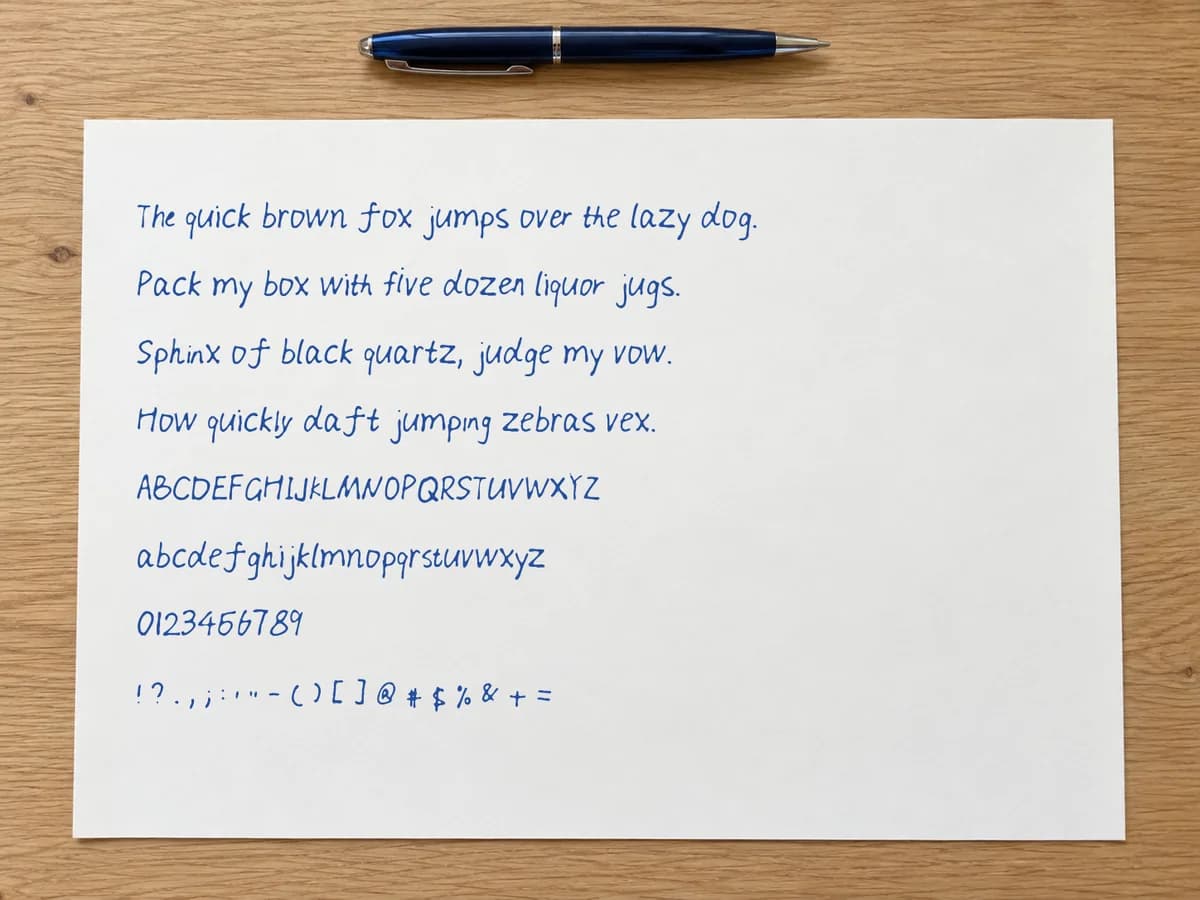
Upload a clear photo of your handwriting. AI uses it as a style reference to generate an editable basic font draft, including characters absent from the photo. Review real words, refine selected shapes, and build a reusable font. A labeled printable template is also available.
AI from a handwriting photo
Crop a clear writing sample. AI generates a complete basic character draft from the visible style; review its predictions before building.
How to use realistic handwriting examples: step by step
- 1
Start with the final use
Decide whether the result will be read on screen, printed, used as a worksheet, or placed in a card.
- 2
Compare a readable baseline
Generate one clean version before trying cursive, corrections, or a more irregular style.
- 3
Hold paper constant while comparing fonts
Change Original handwriting, open-source, and My handwriting on the same fixed paper before switching to photographed paper.
- 4
Review at final size
A page that looks good when zoomed in may be too small or dense after printing at 100 percent.
Compare handwriting sources, not only styles
Original Handwriting 01 is built from real submitted handwriting samples. Open-source fonts such as Dancing Script or Kalam are licensed handwriting typefaces. My handwriting is a font you build from your own template.
Keep the paper and page size fixed while you compare sources. Otherwise texture and framing can hide the real letter differences.
Fixed paper versus photographed paper
Fixed paper at a matching physical size is the reliable choice for printing and multi-page PDFs. Photographed paper is a notebook or stationery photo background; it is useful for scenes, but re-printing that background can muddy ruling and margins.
Neat versus varied examples
Study notes and worksheets need lower Position and Stroke. Shopping lists, labeled props, and assignment mockups can use more variation after the wording is finished.
Practical realistic handwriting examples checks
Common realistic handwriting examples mistakes
Comparing examples at different sizes
A close-up can make small writing look readable. Compare every version at the size it will be printed or shared.
Changing font and paper together
A new surface changes contrast and framing as well as letter shapes. Hold the paper constant while comparing fonts.
Calling photographed paper print photo paper
Photographed paper is a photo of a notebook or stationery sheet. Use a matching fixed paper size when the file must print to exact dimensions.
realistic handwriting examples limits and fit
- A visual example demonstrates one setup; it does not guarantee the same settings fit every text length.
- Printed photos in this library document specific A4/Letter tests. Digital JPEG examples are labeled separately.
realistic handwriting examples FAQ
- What is Original handwriting?
- Original Handwriting 01 is a built-in style made from real submitted handwriting samples. It is not a claim that a printed page was written stroke-by-stroke by hand.
- Can I reuse the settings from an example?
- Yes. Each guide lists the sample text and settings. Open the linked tool or preset, paste the full sample, and match the table before changing anything.
- Why do repeated letters look different?
- Position, Stroke, ink flow, and Shuffle change the seeded instance. Letterform variation on Pro+ can also use alternate glyphs when they exist.
- Should I print photographed-paper backgrounds again?
- Usually no. Use fixed paper for clean reprints. Photographed paper is better when the notebook scene is part of the visual result on screen.
- Where do My handwriting examples come from?
- Build a font from the handwriting template, then type with that saved font under My handwriting. The custom-font guide documents one full example.